Where Are Your Good Visitors Dropping Out of the Enquiry Funnel?
A 1.5% conversion rate tells you almost nothing. The shape of the journey tells you everything.
This article assumes you've already confirmed that the traffic has commercial intent and the page reflects what the ad promised. If you haven't done that yet, start with the intent audit before working through the journey.
The traffic is right and the intent matches. People are landing on the correct page for the thing they actually came to find. Enquiries are still low, and at this point you can stop blaming Google Ads for five minutes, because the problem isn't in the campaign, it's somewhere between the visitor arriving and the visitor deciding to get in touch.
This is the part of the funnel that most insurance and finance brokers either skip entirely or diagnose too broadly. "The website isn't converting" is a useless observation. The website isn't one thing. A visitor lands on a service page, reads some of it, clicks through to another page, goes back, finds the contact page, starts a form, gets frustrated with something, and leaves. Or they don't. You need to know which version of that story is playing out, and for that you need to stop looking at the final conversion rate and start looking at the shape of the journey.
Stop looking at the final conversion rate in isolation
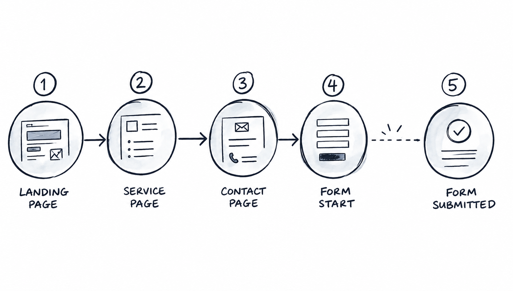
You don't know whether to redesign the page, fix the form, change the CTA, or do nothing at all, because you don't know what happened to the other 1,970 people.
What you actually want is the shape of the journey broken down step by step. If 2,000 visitors arrived, 900 engaged meaningfully with the page, 400 clicked through to a relevant service page, 180 reached the contact or quote page, 130 started the form, and 30 submitted it, now you have something to work with.
A hundred and thirty people started the form and only 30 finished it. That's where you look before spending significant money redesigning the homepage. It sounds obvious when the numbers sit next to each other, but it gets ignored constantly in favour of instinct-led redesigns that address the wrong stage entirely.
Build the funnel before you diagnose it
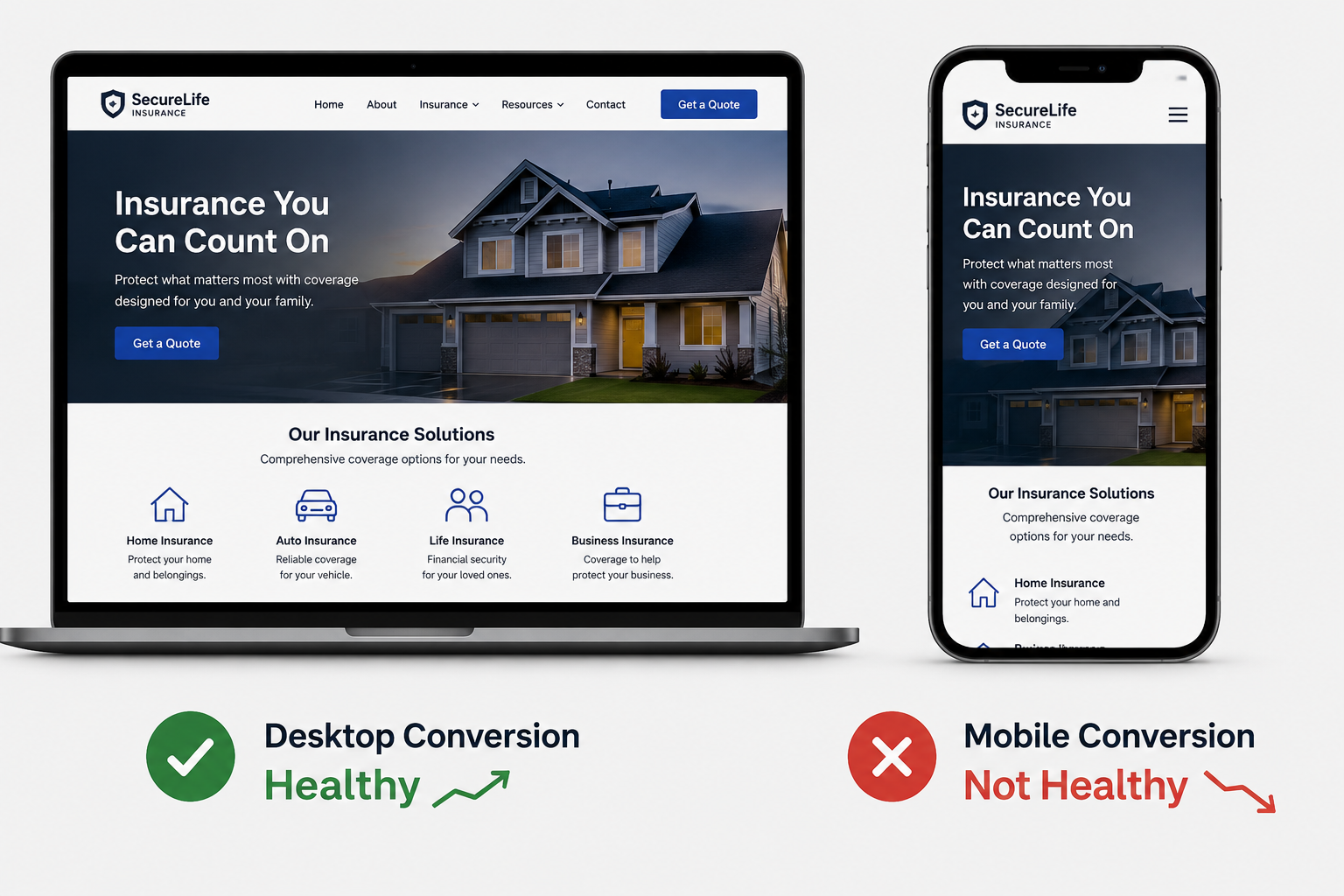
Use the real path, not the one somebody drew in a workshop and never updated. Then put numbers against each step.
If your tracking is poor and you can't attach numbers to the steps, you've already found your first problem. Fix the tracking before drawing any conclusions about where conversion is breaking down, because any diagnosis built on incomplete data will point you toward the wrong fix.
Find the specific drop, not a general weakness
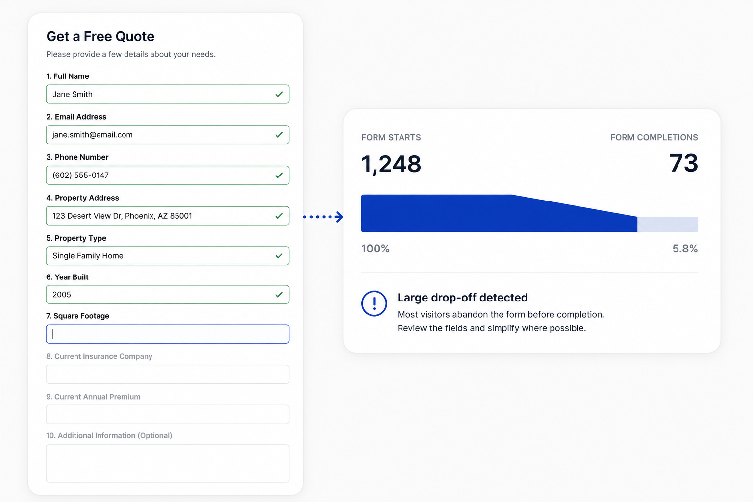
Maybe 60% of visitors who engage with a specialist insurance page click toward getting a quote, which is healthy, but then 70% of those people disappear on the quote page itself. Maybe visitors happily reach the form and abandon it when they hit the fourteenth required field. Maybe desktop converts at a reasonable rate while mobile is performing terribly across the board.
Maybe visitors from a high-value home campaign spend three minutes reading, visit the About page, look for reviews, and then can't find the contact option on mobile and leave.
The goal isn't to find a universally acceptable conversion rate for every step. The goal is to find where your funnel specifically gets worse, because that's where the investigation should start.
Don't confuse activity with progress
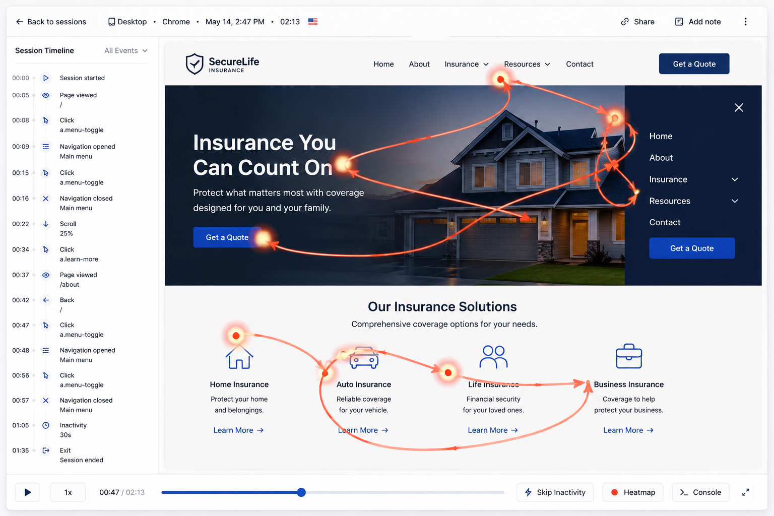
The pattern appears repeatedly in session recordings for broker sites: a visitor arrives on a service page, clicks to About, goes back, opens the menu, tries another service page, returns to the homepage, finds the contact page, goes back again, and then leaves. That isn't a deeply engaged visitor enjoying the experience. That's someone wandering around looking for something the site isn't surfacing clearly.
Pageviews are activity. What matters for an insurance or finance brokerage is whether visitors are progressing toward the commercial action, whether that's reaching the quote flow, starting an enquiry, or picking up the phone. Activity that doesn't lead toward that outcome is a signal, not a success metric.
Split mobile and desktop before you do anything else
This is the step that reveals the most surprising gaps in broker funnels, and it takes about ten minutes. If desktop is converting at 3.2% and mobile is converting at 0.7%, and mobile accounts for 72% of your traffic, that single split explains most of the enquiry gap. The aggregate conversion rate looked like a general problem. The device split shows it's a specific mobile problem, which is a much more tractable thing to fix.
Before commissioning any redesign work, open the mobile journey yourself. Not in a browser window squeezed down to 390 pixels on a desktop machine with a fast connection. Use your phone on a normal connection and try to complete an enquiry. Check whether the CTA is visible without scrolling, whether the keyboard covers half the form when you tap into a field, whether autofill works on the key inputs, whether the phone number triggers a call, whether any cookie banner is occupying a significant portion of the screen, and whether a form error appears after someone has filled everything in correctly.
These are the things that kill mobile enquiry rates while the team is in a meeting discussing whether the hero message needs to be more emotionally resonant.
Look at form starts separately from form completions
These are different problems and they point in different directions. If very few visitors start the form, the form probably isn't the issue. Something upstream is stopping people, whether that's insufficient trust at that stage of the page, a weak or unclear CTA, an ambiguous offer, no indication of what happens after submission, or simply the form being genuinely hard to find. But if a reasonable number of visitors start the form and very few finish it, then the form itself is the thing to investigate.
Low form starts mean you look upstream. Healthy form starts with poor completion mean you look at the form. The distinction sounds simple but it's the split that most conversion audits skip, which is why they end up shortening forms that weren't the problem or rewriting CTAs that were already working fine.
Forms fail in more ways than most people check
The standard advice is to shorten the form, and sometimes that's right. But a six-field form isn't automatically better than a ten-field form, particularly for brokers handling complex insurance or finance products where some qualification genuinely matters to both parties.
The issue isn't form length in the abstract, it's asking for information that feels unreasonable or premature at that specific point in the interaction. Asking someone to provide their full property history before they know whether you can even help them is the kind of friction that ends enquiries before they start.
Look at which fields produce the most abandonment. Look for validation errors that reject correct inputs. Check whether required fields include anything the visitor is unlikely to know offhand. Look for dropdowns with an unreasonable number of options. Check whether any fields duplicate information already collected earlier in the form, which happens frequently on forms that have been added to over time without anyone reviewing the whole thing.
Then actually submit the form yourself and go through the entire process from the visitor's starting point. The number of broken or confusing forms that nobody on the team has tested end-to-end is genuinely surprising.
Use recordings to find out why, not just where
Analytics tells you where something looks wrong in the funnel. Session recordings tell you what it actually looks like when it goes wrong. Tools like Clarity, Hotjar, or FullStory are useful here, but only if you filter intelligently rather than watching recordings at random.
Focus on visitors who reached the contact page and didn't submit, visitors who started the form and abandoned it, visitors arriving from your most important paid search campaigns, visitors who spent time on high-value service pages, and mobile visitors specifically. Then look for patterns across those recordings rather than drawing conclusions from individual sessions.
Repeated clicks on non-interactive elements, visitors scrolling up and down the same section repeatedly, the navigation being opened multiple times in quick succession, form fields being corrected and then abandoned, error messages appearing at specific points, and visitors reaching a particular section and leaving immediately are all patterns worth investigating when they appear across multiple sessions.
One recording is anecdote. Ten people doing the same thing is a diagnosis.
Check the technical basics before anything else
Sometimes the explanation has nothing to do with messaging, trust, or journey design. The form doesn't submit correctly in Safari. The confirmation page fails to load. The phone number on mobile isn't formatted as a clickable link. The page loads slowly on a 4G connection. A required field produces an error message that doesn't explain what the correct format should be.
The CTA button links to the wrong page. The conversion event fires even when the form submission fails, which means the analytics data has been wrong for months and every decision made from it has been based on fiction.
Before running any behavioural analysis, confirm that the basic mechanics work correctly across the devices and browsers your visitors actually use.
Track calls alongside forms
Insurance and finance brokerage funnels are not software checkout flows, because people call and email or read the site on their phone during lunch, come back on desktop that evening, and call the number they remembered from the earlier visit.
If you're measuring only form submissions, you may have a tidy funnel that's missing a significant share of actual enquiries, which means you're optimising for the metric that was easiest to set up in GA4 rather than the one that reflects how clients actually make contact.
Define what an enquiry means for the brokerage specifically. That might include form submissions, inbound calls, quote starts, booked consultations, or a combination of all of them. You should track those.
Otherwise the conversion work improves a number that doesn't represent the business, and the actual enquiry problem stays exactly where it was.
What a useful journey diagnosis looks like
The output of this review should be specific and boring, not conceptual. Not "visitors need more trust signals before converting," which could mean almost anything and justifies almost any intervention. Something closer to: high-intent mobile visitors reach the quote page at a healthy rate, but only 21% of those who start the form complete it, against a desktop completion rate of 58%, and recordings show repeated errors appearing on the address field validation. That's a problem you can fix in an afternoon. Or: visitors arriving from the specialist home insurance campaign engage with the landing page but very few reach the enquiry step, and recordings show repeated visits to the About and Carriers pages before exit, suggesting visitors aren't finding enough evidence that the brokerage handles their specific type of risk.
The journey is the third stage in a four-part review. If you want to see how acquisition, intent, journey, and conversion fit together as a single diagnostic, the full funnel diagnostic covers the complete framework.
Different problems and solutions, both of them far more useful than "the conversion rate is 1.5%, we should redesign the page."
The journey review narrows the search. Once you've found where good visitors stop progressing and addressed that, and the technical setup works correctly, and visitors are reaching the enquiry point without obvious friction, you've earned the right to ask the last question in the diagnostic.
Related posts:
The 4-Pillar Funnel Review for Insurance and Finance Brokers Running Paid Search
Most brokers redesign the page before they know which stage is broken. This is how you find it first.
How to Audit a Broker Conversion Page That Isn't Converting
You've confirmed the traffic is right and the journey works. This is how you find out what the page is actually missing.
How to Check Whether Your Traffic Is Actually Worth Converting
The session count is the least useful number in your report. Here's what to look at instead.