How to Check Whether Your Traffic Is Actually Worth Converting
The session count is the least useful number in your report. Here's what to look at instead.
If paid search traffic has increased by 30% and enquiries have stayed flat, you haven't grown your pipeline, you've grown your ad spend. The session count going up is not the win your agency is presenting it as, and the number that actually matters is not how many people arrived but how many of them had any business being there in the first place.
This is the part of the audit that most insurance and finance brokers never run, because the traffic report looks encouraging and nobody wants to be the one to question it. But the question is worth asking, and it's not complicated to answer. This article covers the acquisition stage of the funnel in detail. If you want the full picture of where enquiries break down across all four stages, [the 4-pillar funnel review] gives you the complete diagnostic.
Start with source-level data, not total traffic
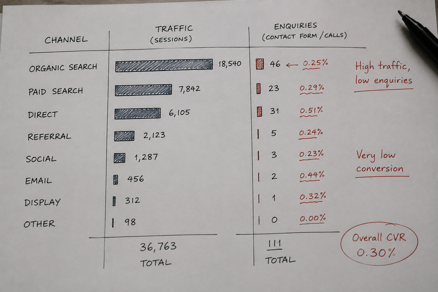
A channel accounting for 40% of sessions might account for 8% of enquiries, while a smaller referral source converts at three times the rate. That's not a traffic optimisation problem, it's a budget allocation problem, and you can't see it without breaking the data down by source first.
Break paid traffic down to the campaign level

The split you're looking for tends to look something like this: Campaign A generates 800 visits and 35 enquiries, while Campaign B generates 2,400 visits and 4 enquiries. Campaign B looks outstanding in a traffic report and looks inexcusable when you're paying for it. This kind of split is common in insurance and finance paid search, particularly where one campaign targets high-intent commercial terms and another runs broader awareness traffic that carries no real conversion intent at the point of click. Combining those two campaigns into a single "Google Ads" line in the report hides the problem completely.
Separate landing page traffic before drawing any conclusions

This is where acquisition quality connects directly to intent. Traffic that looks right at the campaign level can still land in completely the wrong place, and when it does, the problem isn't the page, it's the gap between what the ad promised and what the visitor found. No conversion work closes that gap because the visitor has already decided the page isn't relevant to their situation.
Check geography before you declare growth
Look at the device split and compare conversion rates separately
If the mobile share of traffic shifted from 55% to 80% between two periods and enquiries didn't change, that shift is worth investigating rather than ignoring. Mobile and desktop users convert at different rates on most broker sites, particularly for complex products like specialist home insurance or commercial finance where people often want to speak to someone before completing a form. Combining the two conversion rates into a single number and treating the result as meaningful produces a figure that represents neither group accurately. Compare mobile traffic against mobile enquiry rate and desktop traffic against desktop enquiry rate separately, and if the mobile rate is significantly worse, that tells you where to look next in the journey audit.
The cheap traffic trap is where most paid search waste hides
This is the pattern that agency reporting consistently obscures for insurance and finance brokers, and it's worth being direct about how it works. Campaign A costs $4 per click, generates 1,000 clicks, and produces 80 enquiries. Campaign B costs $1 per click, generates 4,000 clicks, and produces 20 enquiries. Campaign B sits at the top of the dashboard with a lower CPC and a higher click volume, and if those are the metrics the report highlights, Campaign B looks like the better investment. But Campaign A produced one enquiry every 12.5 clicks while Campaign B produced one every 200 clicks, which makes Campaign B four times more expensive per enquiry despite costing a quarter of the per-click price.
The only way to see this is to attach conversion data to cost data at the campaign level, which most traffic reports don't do because the resulting numbers are harder to celebrate.
Score your traffic before deciding what to do with it
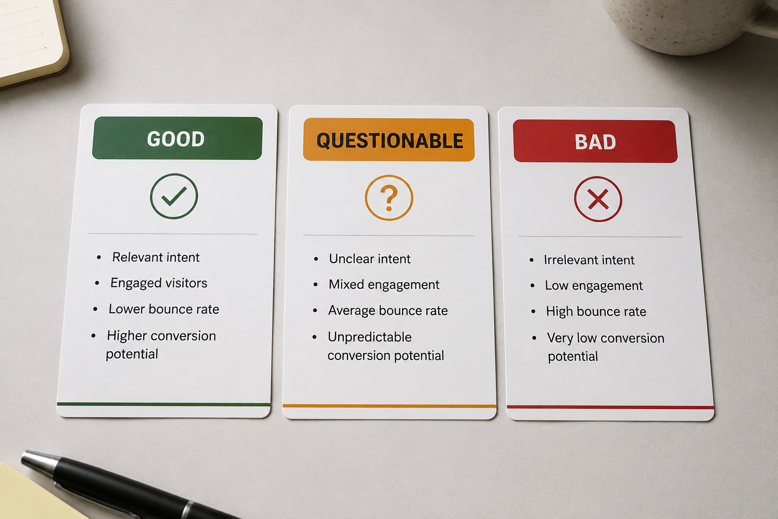
Rather than trying to hold all of this in your head across multiple campaigns and channels, score each major source or campaign across five dimensions: commercial relevance (does this audience actually need the product), intent (are they looking for a solution now rather than just researching), geographic fit (can the business actually serve them), conversion performance (do they enquire at a reasonable rate), and lead quality (are those enquiries worth following up). Based on those scores, the traffic falls into three categories. Good traffic you keep and scale where the economics support it.
Questionable traffic you investigate before making any decisions. Bad traffic you stop paying for, because continuing to pay for it is the only thing keeping the session count looking healthy.
Brokers who understand which traffic is worth converting make better decisions about where to spend and where to cut, and they're far less likely to spend six months redesigning pages that were never the problem. Once you know the traffic is worth converting, the next question is [whether your landing pages match what your ads are promising], because relevant traffic landing on the wrong page converts just as poorly as bad traffic.
Related posts:
The 4-Pillar Funnel Review for Insurance and Finance Brokers Running Paid Search
Most brokers redesign the page before they know which stage is broken. This is how you find it first.
Your Traffic Looks Fine. So Why Aren't People Enquiring?
When the acquisition is right but the page doesn't match what the visitor came for, you have an intent problem. Here's how to diagnose it.
Where Are Your Good Visitors Dropping Out of the Enquiry Funnel?
A 1.5% conversion rate tells you almost nothing. The shape of the journey tells you everything.