How to Audit a Broker Conversion Page That Isn't Converting
You've confirmed the traffic is right and the journey works. This is how you find out what the page is actually missing.
This is the fourth stage of the funnel diagnostic. It assumes you've already confirmed that the traffic has intent, the page matches what the ad promised, and visitors are moving through the site without obvious friction. If you haven't done the journey audit yet, that's the right place to start.
You've confirmed the traffic has commercial intent. The page matches what the ad promised. Visitors are moving through the site without hitting broken forms or disappearing into navigation dead ends. Enquiries are still not where they should be. This is the point where you actually have a conversion problem, and it's the first point in the whole diagnostic where pulling the page apart makes any sense.
The question worth asking here is more specific than "why isn't the page converting." The question is why someone who appears to need the service, has found the right business, and has made it this far still doesn't want to make contact. That's a much more useful thing to investigate, and the answer is almost never "the CTA should be a different colour."
Start with the first screen and don't scroll

A visitor who arrived because their home insurer just declined to renew them doesn't care that you're protecting what matters most. They want to know whether you can place a risk that someone else has already walked away from. A visitor who owns a $3 million property with unusual construction wants to know whether you understand that kind of risk before they spend time explaining it. A landlord managing twelve properties wants to know immediately whether they're talking to someone who handles portfolios or a generalist who will treat each property as a separate conversation. The first screen has one job: tell the right visitor that they're in the right place, that you deal with their situation, and what to do next. Everything else can wait.
Stop writing about the brokerage and start writing about the problem
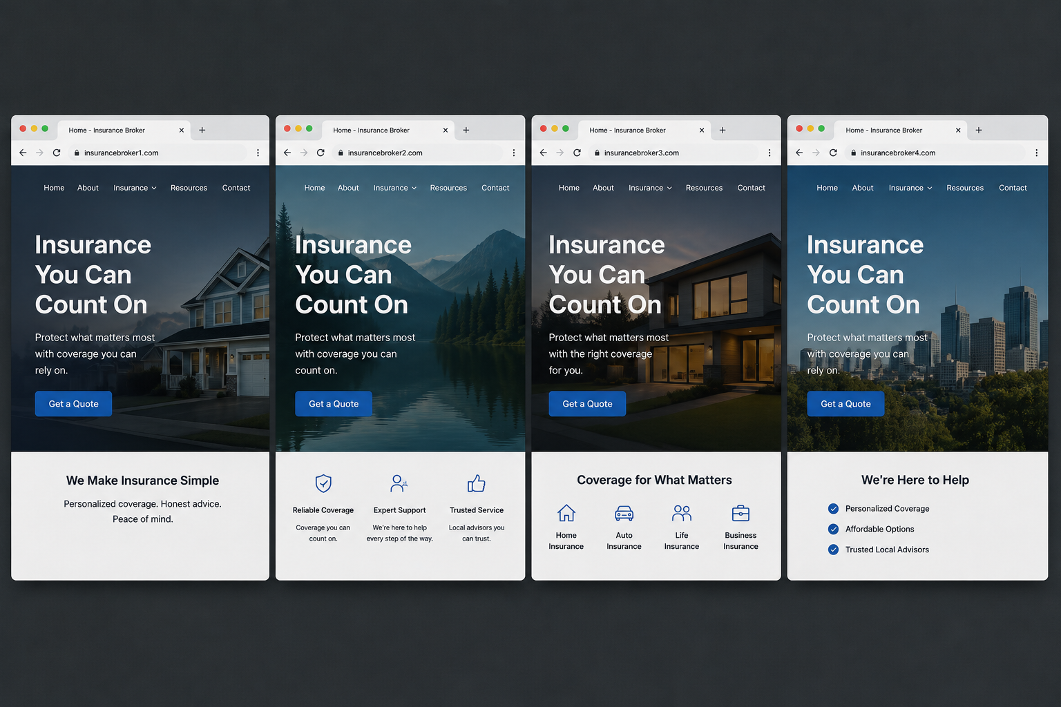
Your experience matters. Your carrier relationships matter. Your track record with complex placements matters. But those things are evidence that supports a claim, not the claim itself. Lead with the visitor's problem, then use your credentials to prove you can solve it. The company biography belongs further down the page, after the visitor has already decided they're in the right place.
Make the specialism obvious and put it at the top
"Personal Insurance Solutions" is a category label. It tells the visitor nothing about whether you understand their situation. Specificity does something different: it signals to the visitor that they won't need to spend the first ten minutes of a conversation educating you about their risk before you can say whether you can help. For insurance and finance enquiries involving anything non-standard, that signal matters enormously, because the visitor has often already had one or two conversations with brokers who couldn't place the risk and wasted their time doing it. If the page still doesn't make the specialism obvious, you may have an intent mismatch problem rather than a conversion problem, and fixing the headline won't close that gap.
Trust has to answer the actual hesitation, not just assert credibility
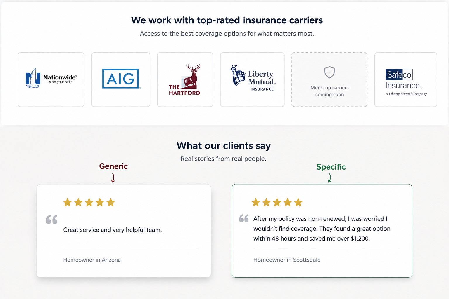
Evidence that answers those specific hesitations converts far better than generic credibility signals. That might mean being explicit about the number or type of carriers you work with for complex risks. It might mean a case study or example that describes a successful difficult placement rather than just asserting that you do them. It might mean a review that explains what the situation was and what you did, rather than five stars and a first name. Good proof addresses a specific uncertainty. A carousel of logos that nobody reads does not.
Use reviews that describe the problem, not just the outcome
If reviews exist, look through them for the ones that describe the original problem, the fear or uncertainty the client had, why they chose the brokerage, what actually happened, and what the outcome was. Those reviews belong on the pages receiving traffic from people with identical or similar problems. Not because social proof increases conversion as a general principle, but because another person has already asked the question sitting in the current visitor's head and the answer is right there on the page.
Check what you're asking the visitor to do and whether it fits where they are
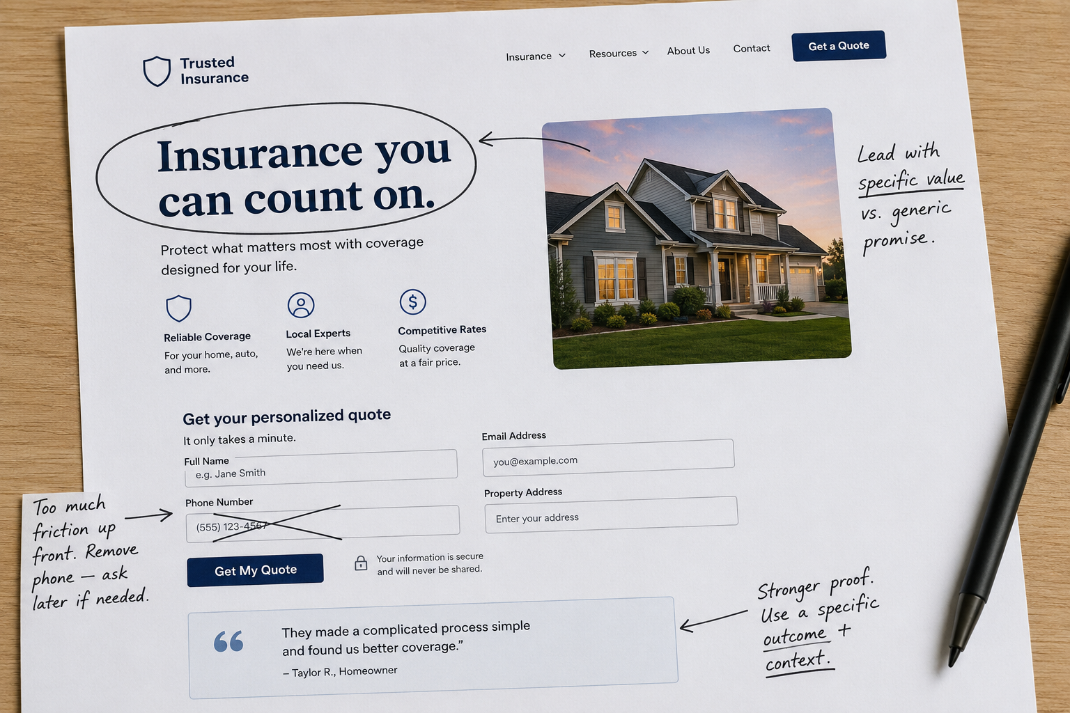
For insurance and finance broker funnels where the risk is anything non-standard, "Talk to a specialist" or "See if we can help" often fits the visitor's position far better than language that implies they're ready to proceed through a transactional process. Think about what the visitor knows and what they're uncertain about at the point they reach the CTA, and make sure the action you're asking them to take matches that position.
Explain what happens after submission
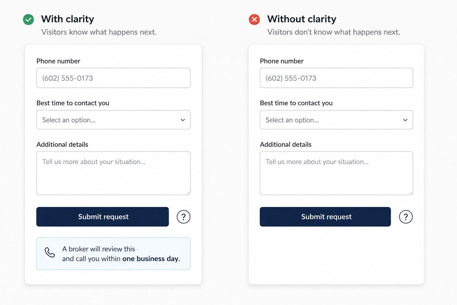
This is one of the most consistently underused elements on broker enquiry pages, and it costs enquiries every day. A visitor reaches the form, fills in their name, email, phone number, and property address, and looks at a submit button with no indication of what happens next. Do you call them? When? Is the information going into a quote engine? Will someone review it first? Do they need to have documents ready? Will they receive automated emails from a CRM for the next six months?
Handing over contact details without any sense of what follows creates friction that kills a meaningful number of form completions. Two sentences next to the form that explain the actual process reduce that uncertainty significantly. Something like: "Send us the basics and a broker will review your situation and contact you within one business day to discuss the options. No obligation at that stage." Whatever the real process is, explain it honestly. Uncertainty at the point of submission is a conversion problem that takes ten minutes to fix.
Look at the form with fresh eyes, not received wisdom
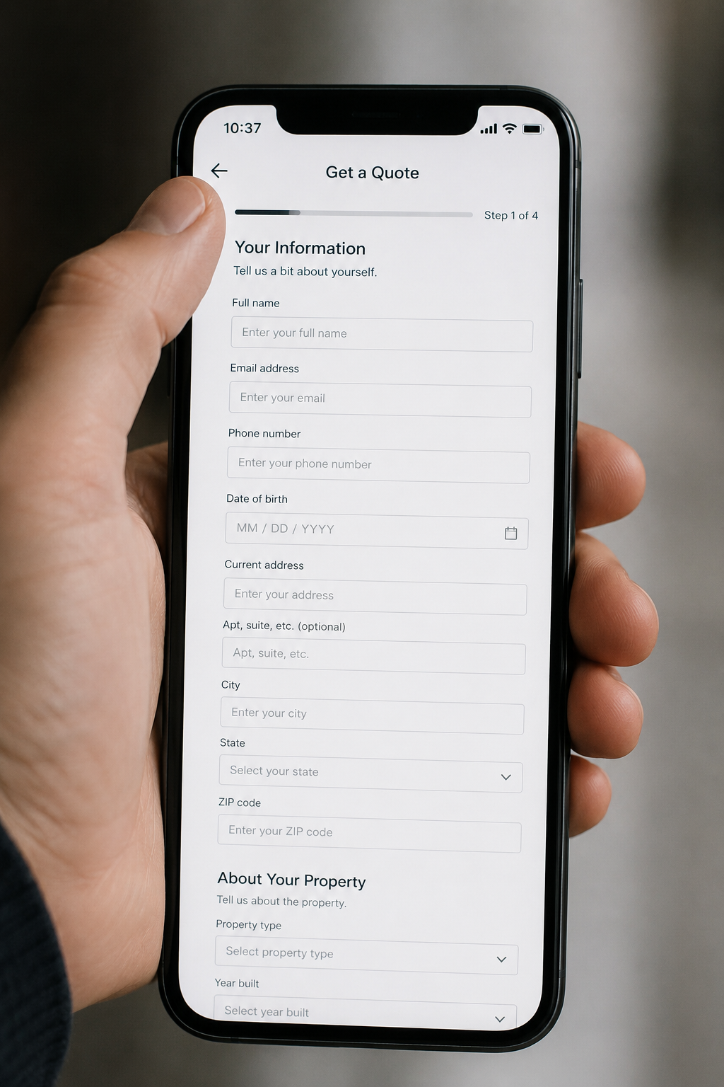
The standard advice about forms is to make them shorter, and that advice gets repeated often enough that it's treated as a universal law. A specialist insurance or finance brokerage may genuinely need certain information before a first conversation is worth having for either party, and there's nothing wrong with asking for it. The question isn't whether the form has six fields or ten, it's whether each field earns its place at that specific point in the interaction.
For every field, ask whether you need that information before the first conversation, whether the visitor is likely to know the answer without looking it up, whether it feels reasonable to request at this stage, and whether the answer changes what you do next. A field that exists because someone wanted it in the CRM three years ago and nobody has reviewed the form since is a field that's costing you enquiries for no good reason. And if you're asking visitors to type information that you could collect more easily later in the process, you've created friction to solve an internal process problem at the visitor's expense.
Find the unanswered objection rather than inventing one
This is the part of conversion work that most audits skip in favour of generic recommendations, and it's the part that produces the most specific and actionable findings. A visitor who made it to the enquiry page is interested. Something stops them from completing the action. The job is to find out what that thing actually is rather than assuming it based on a CRO checklist.
The real objections for insurance and finance broker enquiries appear in sales call notes, customer emails, search query data, competitor reviews, and direct conversations with the brokers themselves about what people say before they decide to proceed. When you ask brokers what hesitations come up repeatedly, you hear the same things: can you cover this specific situation, how much more expensive will this be than what I'm paying now, I've already been declined by someone else, do you work with a particular carrier, how quickly can you get something in place, will an actual person call me or will I get automated emails. That's the copy your page needs, written the way a client actually talks, not the language of a branding exercise. "Experience the difference of personalised insurance solutions" answers none of those objections.
Fix what the evidence points to, not everything at once
When you've identified two or three specific conversion problems with evidence behind them, the instinct in many organisations is to commission a full website redesign. This is almost always the wrong response. Changing everything at once makes it impossible to know what actually worked, introduces new problems alongside the fixes, takes far longer than addressing the specific issues, and often replaces things that were working fine with untested alternatives.
Fix the things you have evidence for. If visitors from a non-renewal campaign aren't seeing any indication that the brokerage specialises in difficult placements, make that specialism explicit on the page. If visitors need evidence of experience with high-value properties before they'll enquire, put that evidence where they'll find it. If the form creates uncertainty about the next step, explain the process. If one specific field is causing abandonment, deal with that field. You don't get better results for changing more things; you get better results for changing the right things.
What a useful conversion diagnosis looks like
The output of this review should be specific enough to point directly at a fix, not broad enough to justify almost anything. "The website needs stronger trust and clearer CTAs" is the kind of sentence that belongs nowhere near a serious conversion audit. It could describe almost any page and justify almost any change.
Something useful looks like this: visitors from the non-renewal paid search campaign reach the enquiry section at a reasonable rate, but the page never indicates that the brokerage specialises in difficult placements. Session recordings show visitors opening the service pages repeatedly before leaving, suggesting they're looking for confirmation that non-renewals are within scope. Several customer reviews describe successful non-renewal placements, but none of them appear on this page. That's a diagnosis. You know what to change and roughly what to expect from changing it.
Or: high-value home visitors engage with the landing page and reach the form at a healthy rate, but completion is poor. The form asks for detailed property information before explaining what happens after submission. Multiple reviews mention the value of speaking directly with a broker as a reason for choosing the business. That's a different diagnosis pointing toward a different fix.
If you followed [this diagnostic from the beginning], you should now have a clear view of where the enquiry problem actually lives. And if you still don't know, the answer isn't to redesign the page. The answer is that you haven't found the problem yet, and changing things without finding it first is how brokers spend their marketing budget solving problems that don't exist.
Related posts:
The 4-Pillar Funnel Review for Insurance and Finance Brokers Running Paid Search
Most brokers redesign the page before they know which stage is broken. This is how you find it first.
Where Are Your Good Visitors Dropping Out of the Enquiry Funnel?
A 1.5% conversion rate tells you almost nothing. The shape of the journey tells you everything.
How to Check Whether Your Traffic Is Actually Worth Converting
The session count is the least useful number in your report. Here's what to look at instead.