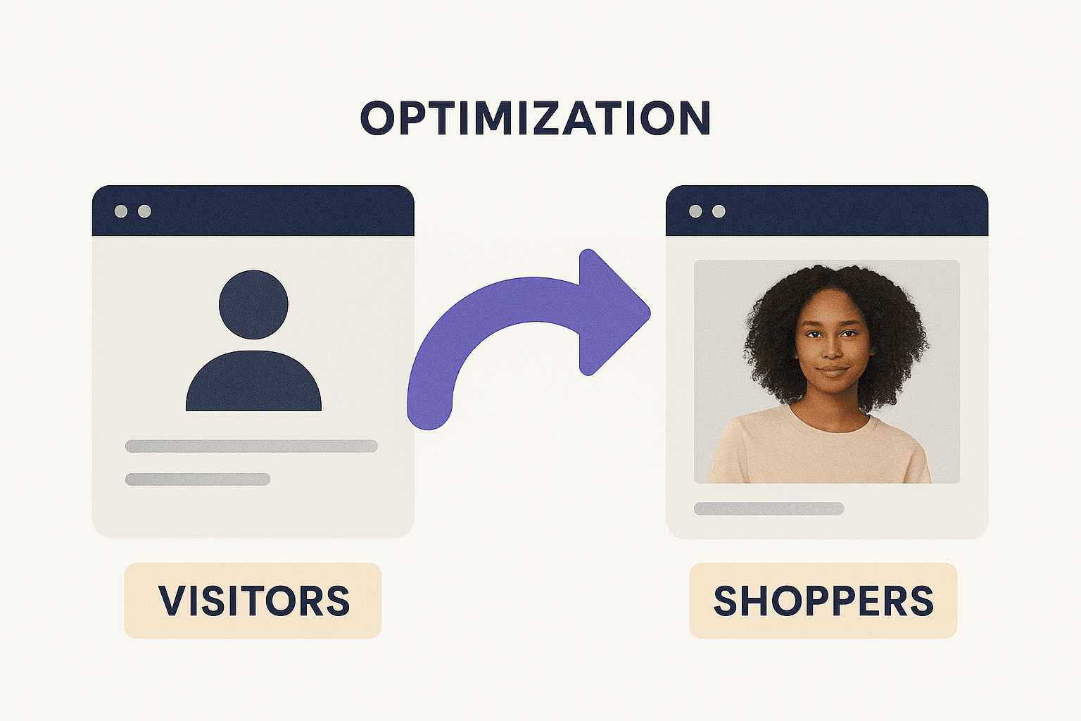
Why 80% of Cold Traffic Bounces in 5 Seconds — And What to Fix First on Your Product Page
Discover why most cold visitors leave in under 5 seconds.
It's a story that echoes across marketing groups, Reddit threads, and social media feeds:
If you're running paid ad campaigns, this scenario probably feels all too familiar. You’ve crafted compelling ads, invested real money, and succeeded in driving traffic. On the surface, everything’s working. But behind the scenes, the results just aren’t there. No signups. No sales. Just an expensive stream of empty clicks.
The problem? It’s not your ads. It’s what happens after the click.
When a cold visitor lands on your product or landing page, you have only a few seconds to make things clear, what you offer, why it matters, and why you're worth trusting. If that message isn't instantly obvious, they’ll bounce before you even realize they arrived.
That’s why it's time to stop obsessing over getting more traffic and start focusing on what visitors experience once they arrive. Your most urgent task isn't to improve ad performance. It’s to fix the first impression your site makes.
In this article, we’ll break down the core elements of a high-converting product page. You’ll learn exactly what to fix first so your hard-earned traffic doesn’t go to waste and how to finally turn those clicks into customers.
The Most Overlooked Conversion Problem Starts at the Top
You've got Google Ads running, bringing in clicks, but your sales aren't following. It's a common, frustrating problem. The truth is, the issue often starts the very moment a visitor lands on your page in the first five seconds.
In that tiny window, your page has to answer three crucial questions for a new visitor, and answer them fast:
What is this? (Is what you're offering clear?)
Why should I care? (What's in it for them?)
Can I trust it? (Do you seem reliable?)
If any of these questions are unclear, even for a second, your visitor will leave. It's that simple.
Start with Your "Hero" Section
The most impactful place to begin fixing this is the hero section, the top part of your page that's visible without scrolling. By rewriting and restructuring this area, you can make your offer more straightforward and better align it with your ad's promise.
Here are the key changes to prioritize:
- A stronger, benefit-driven headline: Your headline should instantly tell visitors what they'll gain and directly relate to the ad they just clicked. For example, instead of a vague product name, use "Collector's Edition for Offshore Sailors."
- Transparent pricing and urgency cues: Don't make people search for the price. If applicable, show it clearly and add a reason to act now, like "Only 500 copies available. Pre-order now."
- Trust indicators upfront: Immediately build confidence by showing star ratings, guarantees, mentions in the press, or social proof. Pull these right into the first view.
If your product is genuinely good and the traffic from your ads is relevant, a lack of clarity and urgency in this top section is usually the main culprit, not your price, your offer, or even the ads themselves.
Optimize the Customer's Journey
Once your hero section is optimized, you can then dig deeper. The next step is to analyze your entire user journey to find any "friction points" that might stop people from converting. This means looking at every step and improving the smaller actions (micro-conversions) that lead to a sale.
This is where your overall landing experience truly shapes performance.
At Growthlens.io, our rapid CRO audits are built to uncover exactly where things fall apart. Whether we're reviewing a Shopify product page, a lead funnel for a service business, or a digital product launch, we keep seeing the same pattern. Cold traffic arrives, then bounces within the first 5 to 15 seconds.
This happens because the page doesn’t clearly communicate what’s being offered, why it matters, or what the visitor should do next.
Before You Scroll: Why Above-the-Fold Design Matters Most
One of the biggest mistakes in designing for conversions is treating your landing page like it's a sales pitch for someone who's already deeply interested. Most cold visitors are far from ready to commit. They're curious, easily distracted, and will quickly leave if anything feels off.
That's why the most effective first fix for conversions is consistently the same: optimize the section above the fold.
Before they even scroll, every visitor should immediately understand:
- What is being offered
- Who it is for
- What action to take
- Why the page or product is trustworthy
To make this crystal clear, the very top of your page should include:
- A headline focused on outcomes, not vague mission statements
- Clear pricing, value propositions, and a visible call to action
- Trust signals like reviews, press mentions, guarantees, or units sold
- A clean visual layout that allows for quick scanning, preventing cognitive overload
These straightforward changes often deliver better results than complex technical tweaks or lengthy A/B tests. In many cases, you can achieve significant gains without needing heatmaps, analytics dashboards, or weeks of data collection.
What you need is an experienced outside perspective, someone who understands conversion psychology and can quickly pinpoint what's stopping users from taking action.
Four Examples of What Works
When someone clicks on your paid ad, especially a cold user, they arrive with minimal context. They aren't in research mode, and they're not reading carefully; they're scanning. The first few seconds determine whether they stay or leave.
If your landing or product page doesn't quickly answer these three critical questions, they'll leave, often without even scrolling:
This pattern shows up across many industries, and the fixes often follow a similar path. Here are four real-world examples:
Law Firm Landing Page
An immigration services site was driving Facebook traffic to a generic headline: "Secure Your Future." Users couldn't tell what the offer was or how to begin. After rewriting the hero section to say "Flat-Fee Immigration Services for Families Moving to Canada," bounce rates dropped by 28% and qualified leads increased within one week.
Health and Wellness Digital Product
A telehealth company promoted hormone balance tests through Meta ads. The landing page was long, visually cluttered, and featured vague calls to action (CTAs) like "Learn More." After simplifying the copy, adding trust badges, and making pricing clear, trial starts doubled.
Educational Product Funnel
For WriteStories, a digital storytelling platform for children, the original page buried key benefits below the fold. By moving proof points and trust elements into the first scroll such as parent reviews, free trial CTAs, and secure checkout language, conversion rates increased from 0.7% to 2.3%.
Online Tutors (Bonjour Tutors)
This client got solid click-through rates from Facebook ads, but most users left within seconds. The problem: no visible trust cues, unclear messaging, and no guided next step. After introducing urgency-based CTAs, tutor previews, and booking confidence elements, the funnel began generating consistent paid bookings from cold traffic.
These examples highlight a common thread: even strong ad campaigns fail when the landing experience lacks clarity, relevance, and trust within the first few seconds.
Are you seeing similar issues with your landing pages?
How Growthlens.io Boosts Your Conversions Fast
At Growthlens.io, we help ecommerce, info products, and service-based brands quickly close conversion gaps. We aim to stop you from wasting more of your budget on ad traffic that isn't converting.
Here's how we work:
- Submit your page: Clients send us their landing or product page.
- Rapid CRO Audit: I perform a focused 3 to 4-hour conversion rate optimization (CRO) audit using proven strategies for ecommerce and high-intent funnels.
- Detailed Action Plan: We deliver a clear, concise action plan that outlines exactly what's blocking conversions and how to fix it, without any jargon or fluff.
- Results Delivery: You receive your results in a clean report online with on-screen annotations.
This fast audit process has already helped:
- CampusBear, a digital service, significantly boost lead generation from cold traffic
- WriteStories, an education platform, transform passive clicks into qualified leads
- A pre-order book launch convert Google Performance Max traffic by using clearer value framing and a lead magnet strategy
After the initial audit, our team can also help improve lead capture, email flow strategy, and A/B testing. But remember, the priority is always clarity.
For any business running ads and struggling to convert traffic, the problem may not be the ad itself, but what happens immediately after the click. Whether it's a Shopify store, a service-based funnel, or a digital product launch, real conversion growth begins with a clear and compelling page experience.
Growthlens.io delivers fast, conversion-focused insights that help you turn your visitors into customers before spending the next ad dollar.
Related posts:
The Core Principle: Match the Page to the Traffic's Awareness Level
Why the gap between your ad promise and your landing page is costing you cold traffic conversions — and what four structural fixes actually change.
How to Optimise CTA Intent for Cold Traffic on Google Ads Landing Pages
Cold Google Ads traffic won't convert on a high-commitment CTA. Learn how to align your call to action with buyer stage intent and fix the conversion gap on PPC landing pages.
Why People Start Your Quiz and Never Finish It
The structural drop-off points inside most quiz funnels — and the design fixes that move completion rates from 40% to 70% and above.