Why Reworking Your Navigation Menu is the Fastest Way to Lift Conversions
10 navigation fixes to boost ecommerce conversions fast.
When most teams think about conversion rate optimization (CRO), they jump to copy tweaks, A/B testing CTAs, or redesigning landing pages. But one of the most overlooked levers in ecommerce CRO is navigation.
Your navigation menu is the map of your customer journey. If it’s cluttered, shallow, or unclear, visitors bounce before they find what they need. If it’s structured to guide users smoothly from broad browsing into narrow, personalized choices, conversions rise.
After 10+ years running CRO audits, I’ve seen navigation fixes alone lift revenue faster than full design overhauls or campaign launches.
How Website Navigation Affects Conversion Rate

- Findability → how quickly users locate the product they want.
- Decision-making → filters and categories reduce decision fatigue.
- Retention → clear pathways create smoother repeat visits.
If your menu is vague or your filters buried, your conversion rate suffers.
Common Navigation Mistakes That Hurt Conversions
- Generic top-level menus (“Men / Women”) with no context.
- Filters hidden behind 3+ taps on mobile.
- Overloaded mega menus that overwhelm visitors.
- Empty or irrelevant categories that create dead ends.
- Filters that take too long to load or reset after each tap.
Each of these issues creates friction that costs revenue.
CRO Best Practices for Navigation Menus
- Breadth to narrow: Start broad (“Dresses”) then narrow down (“Summer > Under $100”).
- Decision psychology: Reduce overwhelm with clear categories by use case, occasion, or intent.
- Mobile-first: Sticky filter buttons + fast-loading menus.
- Data-driven design: Prioritize categories and filters based on analytics, not assumptions.
The Role of Filtering in Ecommerce UX

- On desktop: persistent left sidebar.
- On mobile: sticky, floating “Filter” button with priority filters (size, price, availability).
Example:
- A recent client, an apparel brand that surfaced filters immediately saw 54% increase in filter use and 19% lift in mobile checkout conversions.
- A travel marketplace restructured menus by experience type instead of A–Z destinations and saw 38% longer session times and 15% more bookings per session.
How to Audit Your User Journey for Navigation Friction
A user journey audit reveals where navigation fails:
- Quantitative data: click-through rates, drop-offs, filter usage.
- Qualitative data: heatmaps, session replays, scroll maps.
Steps:
- Identify where users stall or bounce.
- Quantify revenue lost at each point.
- Prioritize fixes with an impact vs. effort framework.
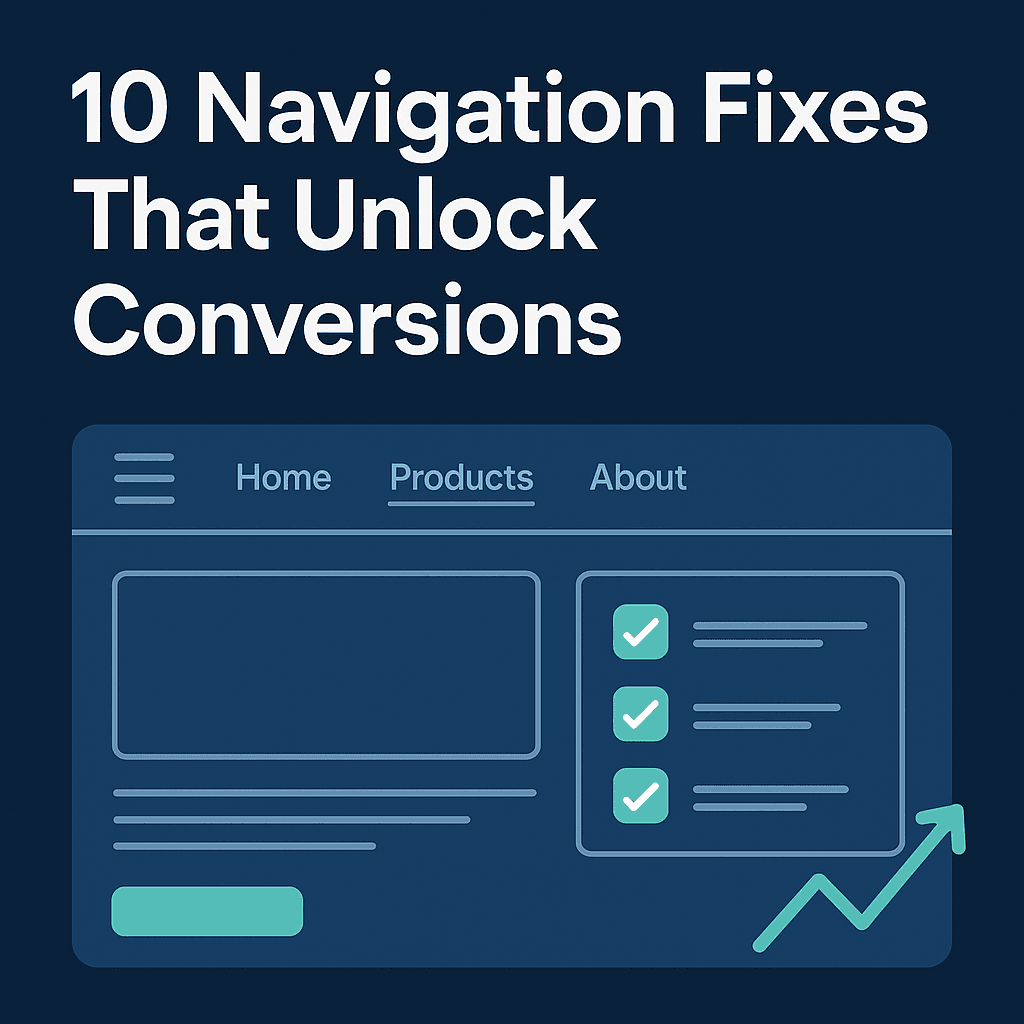
10 Navigation Fixes That Unlock Conversions
- Restructure menus to follow user intent, not internal org charts.
- Use clear, descriptive labels (avoid jargon).
- Group categories by context (e.g., “Workwear” or “Adventure Travel”).
- Limit top-level items to 5–7 max.
- Make filters sticky and always visible on mobile.
- Prioritize most-used filters (size, budget, date).
- Add active filter indicators (“3 filters applied”).
- Ensure filters load instantly, without page reload.
- Remove empty or low-stock categories.
- Test filter order and naming with real users.
FAQs About Navigation and CRO
Q: How does site navigation affect conversion rate?
A: Clear navigation reduces bounce rates and decision fatigue, leading to higher product discovery and conversions.
Q: What is a user journey audit?
A: It’s an analysis of how users move through your site, identifying friction points in navigation, filtering, and overall flow.
Q: What are common navigation mistakes?
A: Too many top-level options, hidden filters, and unclear category labels are the biggest CRO killers.
The Competitive Edge of Great Navigation
Apparel brands that make it easy to go from “I like dresses” → “This red, size 8, under $80 dress” win more sales.
Travel brands that guide users from “I want adventure” → “This exact South America trip” win more bookings.
Navigation is not just UX. It’s a conversion engine.
Unlock Your Own Navigation Wins with GrowthLens
I built GrowthLens to help ecommerce teams run navigation and user journey audits without guesswork. Our beta shows exactly where users drop off and which filters or categories drive conversions.
👉 Sign up for the GrowthLens beta to see where your menu could be costing or winning extra revenue. Need our growth lens to take a look at your funnel and data or simply drp your conversion pain point, just email me at hello @ growthlens.io
Related posts:
The Core Principle: Match the Page to the Traffic's Awareness Level
Why the gap between your ad promise and your landing page is costing you cold traffic conversions — and what four structural fixes actually change.
Why People Start Your Quiz and Never Finish It
The structural drop-off points inside most quiz funnels — and the design fixes that move completion rates from 40% to 70% and above.
Cold vs Warm Traffic: Why Your Landing Page Converts One and Loses the Other
Cold vs Warm Traffic: Why Your Landing Page Fails One