Why eCommerce Landing Pages Don’t Convert — 3 CRO Fixes That Drive Sales
Struggling with low conversions on your fashion eCommerce landing page?
Too many fashion and lifestyle eCommerce brands lose sales not because their products are subpar — but because their landing pages never gave them a fair shot.
You might have a premium product, a stunning photoshoot, even a celebrity co-sign. But if the landing page lacks clarity, cohesion, or conversion-focused structure, you're essentially putting a five-star product into a one-star container.
After dozens of CRO audits — and a recent deep dive with the team at Sunset Society — I’ve identified three core principles that separate high-performing eComm landing pages from the ones bleeding ad spend.
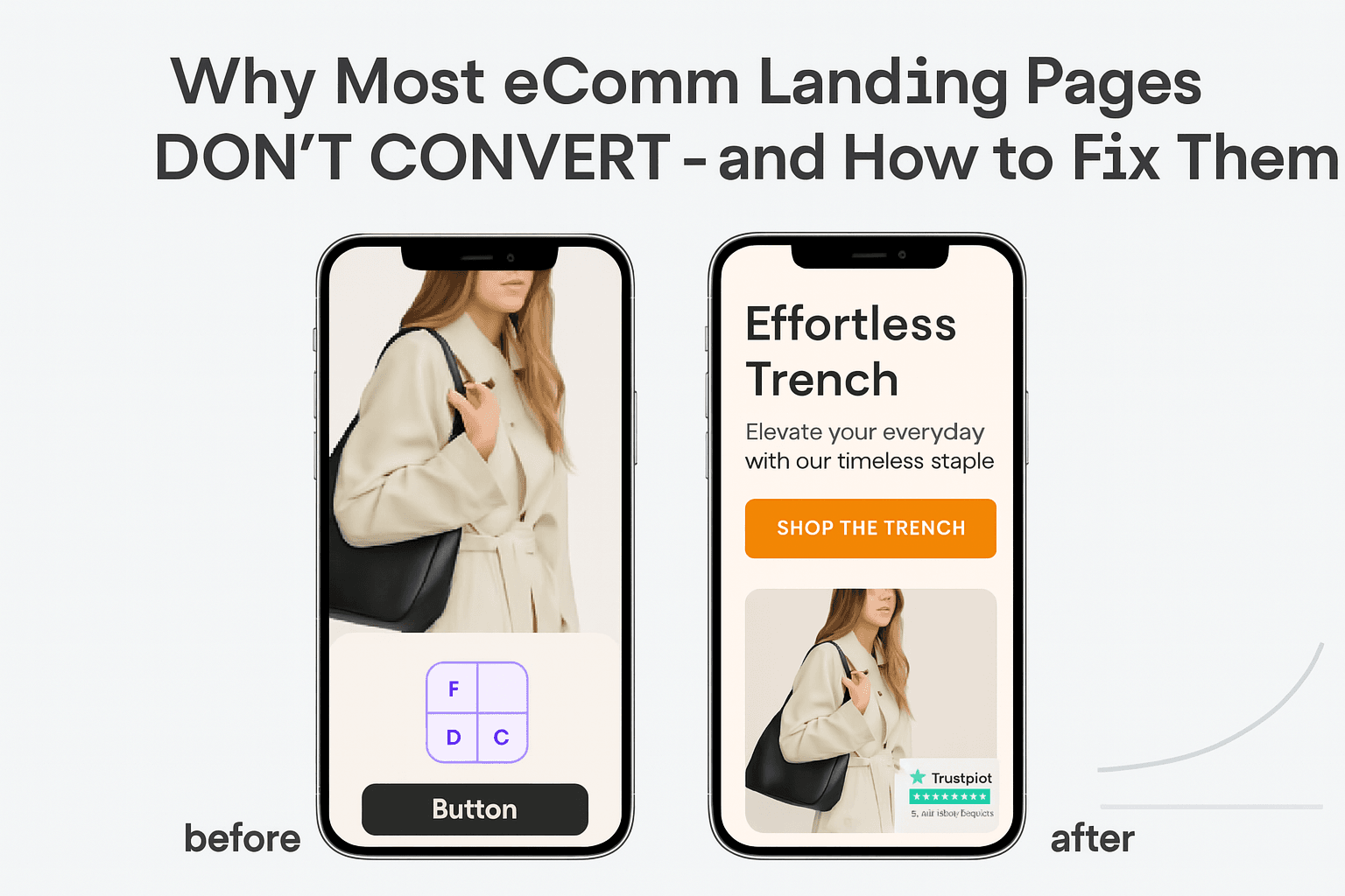
1. Match the Visitor’s Intent Immediately
Within 3–5 seconds, the user should know:
- What you sell
- Who it’s for
- Why they should care
Think about it from the user’s perspective. They just clicked your Meta or Google ad. They’re half-distracted. You have one moment to anchor attention and make them feel like they landed in the right place.
Winning Formula:
-
Headline: Focus on the benefit, not your brand name.
For example, instead of “Introducing the Amalfi Collection,” say “Effortless Summer Layers for Italian-Coast Vibes.”
-
Hero Visual: Show the product in context. People need to imagine wearing it, not just admire a flat lay.
For luxury brands, that could mean a model wearing the product in a setting that matches your lifestyle positioning—like a rooftop party or European resort.
-
Subtext/Value Prop: Speak directly to the user's desire.
Example: “Premium Italian linen, tailored for your best summer yet.”
What We Fixed for Sunset Society:
Their original hero featured moody editorial images. Beautiful, but vague. We reworked the layout and headline to be benefit-led and context-rich: “Statement Pieces for Sunset Moments,” paired with imagery that reflected that theme. Engagement time jumped, and bounce rate dropped.
Fashion Insight:
Even in luxury, clarity outperforms cleverness. Art direction is critical—but don’t sacrifice context for aesthetic minimalism. If a user can’t tell what you sell from the hero section, it’s costing you.
2. Reduce Friction and Decision Fatigue
You’re not just selling clothes—you’re guiding a decision. Any confusion or delay creates drop-off.
Core Elements of a Low-Friction Page:
- Linear, scrollable layout that builds desire step-by-step
- Skimmable value propositions and feature highlights with clear icons or short, punchy copy
- Trust signals placed at high-friction moments
- Visual hierarchy that guides the user naturally through the content

Fashion-Specific Trust Builders:
- Real customer photos showing how the product fits
- Transparent fit guidance, such as “Runs slightly oversized. Model is 5’9 wearing size S.”
- Clear shipping and return timelines that reduce anxiety. For example, “Order by Wednesday for Friday delivery” or “30-day no-questions-asked returns”
What We Improved for Sunset Society:
Users were dropping off mid-scroll. We found the culprits: unclear product tiers, vague sizing details, and a returns policy buried in the footer. We fixed this with better icon copy, trust badges placed closer to the CTA, and streamlined content to reduce unnecessary scroll depth.
Fashion Insight:
Luxury shoppers are not just buying a product—they're buying assurance. Reduce hesitation by making your offer feel low-risk and effortless to say yes to.
3. Offer and CTA Clarity
“Shop Now” isn’t compelling on its own. A great CTA is the result of a motivated journey. It has to feel like the next natural step, not a forced nudge.
Key Elements:
- CTAs placed after value-driving sections—such as product images, customer reviews, or feature highlights
- Scroll-anchored CTAs that remain accessible on mobile
- Microcopy that speaks to a user’s intent or desire, like “Upgrade Your Weekend Look” or “Choose Your Fit”
Sunset Society’s Fix:
Their CTA wasn’t broken—it just wasn’t persuasive. We restructured the page to flow value → action, and updated the CTA copy to reflect their brand tone and customer mindset. “Claim Your Sunset Look” performed better than “Shop Collection,” increasing clicks and downstream purchases.
Fashion Insight:
The CTA should feel like an invitation, not a command. Your buyer is in discovery mode—your job is to meet them with language that feels intuitive and timely.
Consider Mobile Experience First
Over 70% of eCommerce traffic in fashion comes from mobile. Still, many brands treat mobile as an afterthought, compressing desktop layouts into tiny screens.
Mobile Audit Questions:
- Does the hero image load full-screen, without a scroll?
- Are CTAs always visible, or sticky on scroll?
- Is the product information easy to read with a thumb scroll—not tiny or hidden behind accordions?
Test your landing page on an actual device, not just a resized browser window.
Your Page = Your Positioning
Ultimately, your landing page is more than a design asset. It’s positioning at a glance. It communicates:
- Who you are
- Who it’s for
- Why it matters—right now
That’s where GrowthLens CRO Audit Service comes in. We don’t just identify where you're losing conversions. We show you how to fix it with high-impact changes you can implement right away.
You’ll walk away with:
- A clear analysis of what to fix and why
- Copy, layout, and UX suggestions customized to your brand
- Tactical insights rooted in real-world performance data from fashion and lifestyle brands
Ready to See Where You’re Losing Sales?
-
A personalized landing page teardown delivered in 24 hours
-
A personalized landing page teardown delivered in 24 hours
-
Actionable fixes you can apply instantly
-
An optional consult call to go deeper into strategy
Spots are limited as we fine-tune the beta process. Let’s make your product shine on the page—just like it does in real life.
Related posts:
Shopify E-Commerce Funnel Audit Why Checkout Conversion Rates Collapse
Many Shopify brands face the “vanishing act¨, shoppers with no checkout.
From Browsing to Buying: Fixing Conversion Leaks in Apparel E-Commerce
Discover proven CRO tactics for apparel brands to turn views into purchases.